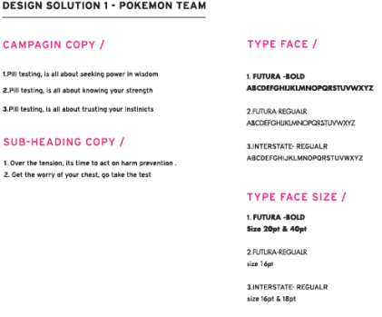
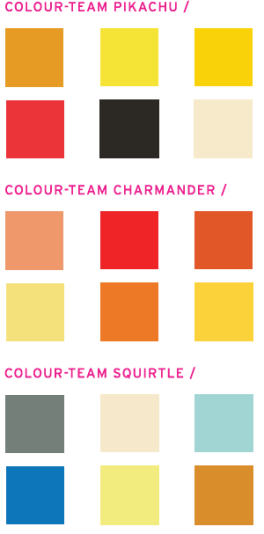
During this week break (mid session – recess) my main aim was to create and work on my previous draft posters , constantly making sure I’m evolving my designs , making the type and illustration elements work together. I decided to use the same colours and style keeping with the vintage feel within each design. The first step before creating any more poster design or images , as suggested by Gregor , was to work on developing campaign copy , making sure the copy related to the main idea of Harm prevention and pill testing in Australia . The following phrases below are campaign copy i brain stormed.
- Stop, think and test
- test can save your life,give it a chance
- the test is best , don’t listen to the rest
- push for the test , heck lets just say yes
- stop the harm , its time to accept a pill checking test
- why risk it , when you can test it
- Be brave, be smart, get real, drug testing can save lives
- Pill testing isn’t a radical idea, its basic harm reduction
- Make an informed choice, choose to test
- No more overuses, there is no more excuses
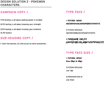
- Over the tension, its time to act on harm prevention
- Do what’s best, come do a pill test
- Can I have your Attention, pill testing can be a way for harm prevention
- Don’t stand still, just go and test your pill
- Get the worry off your chest, go take the test
After further evaluation of the phrases i came away with two standouts that i believed would stand out within the project and relate well with the design and project aim. These are :
- Get the worry off your chest, go take the test
- Over the tension, its time to act on harm prevention
Critical incident = choosing to change the sub tag line , in the poster campaign , to “over the tension , its time to act on harm prevention”
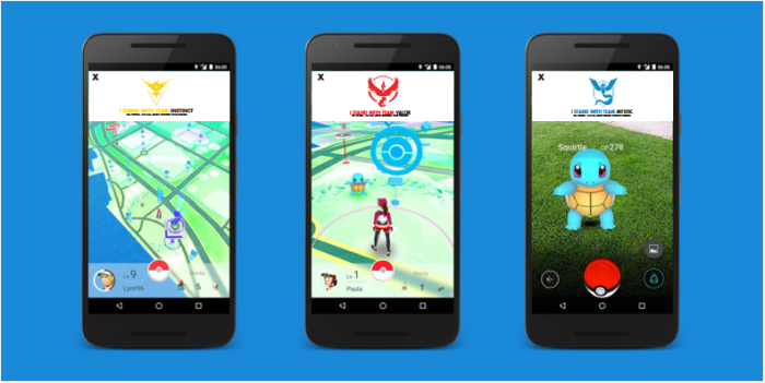
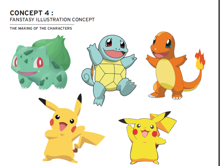
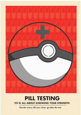
From here i made different version for the poster campaign , making sure to explore all the different aspects of the same theme. After intensive research it became clear that using just the game icons found within the game of Pokemon wasn’t going to work properly , so i decided to step away from this idea (as found below).
As a result I went back to researching more about the game .This is where i came across a few websites that started talking about the different teams in the Pokemon go app . As i kept reading their site , they author started talking about what team you as a player should chose. In the game their are three teams available in which you as the player can choose from. While doing so different blog post, kept popping up regarding what teams to choose when playing the game . From reading the team qualities from a few blog post , it suddenly became clear that i could potential use the Pokemon teams in order to relate their qualities to pill testing. That maybe i could combine these two elements giving me me the main text and colour scheme for the poster , while incorporating the one of the two phrases above.
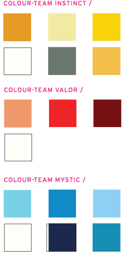
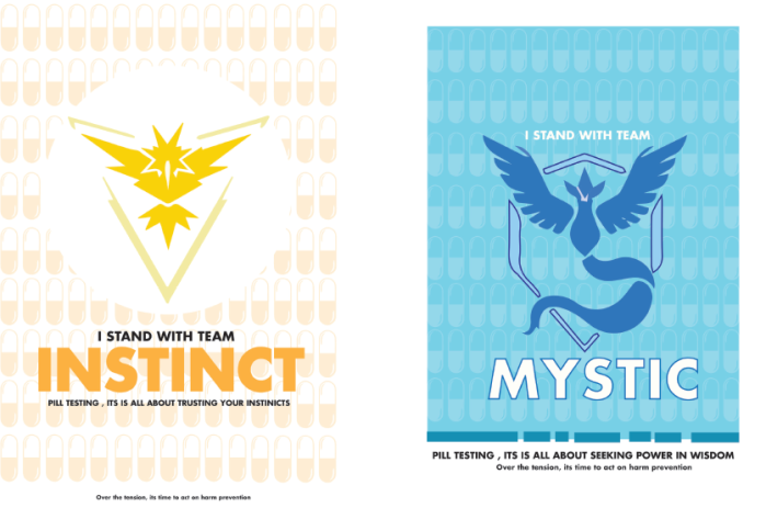
The Three teams
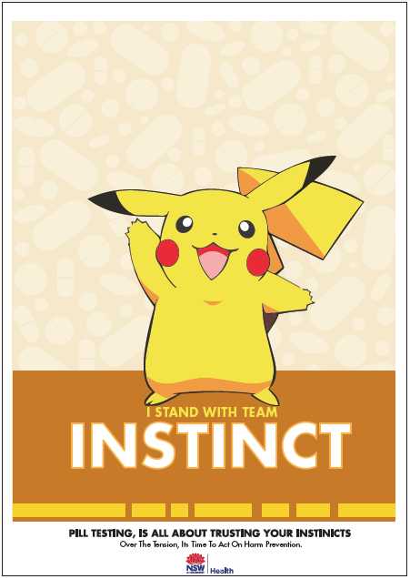
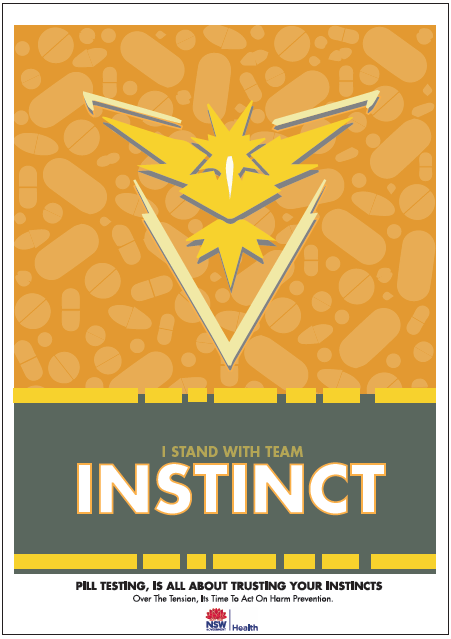
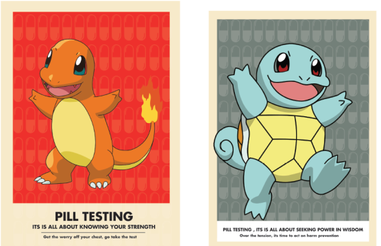
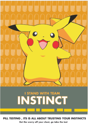
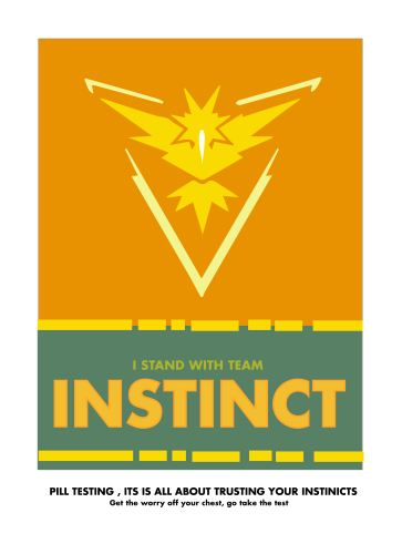
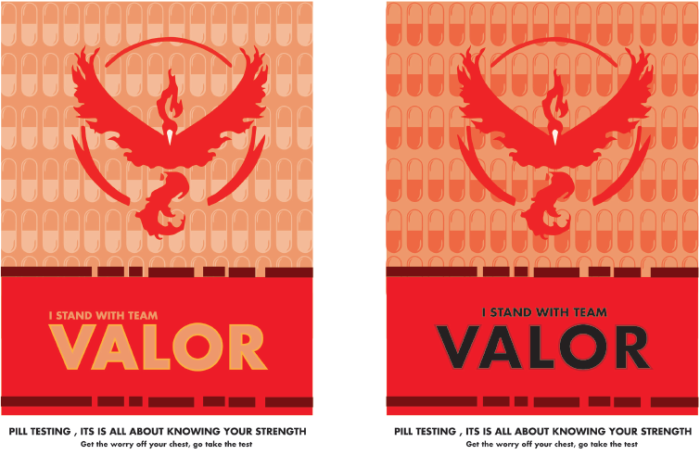
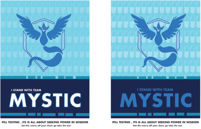
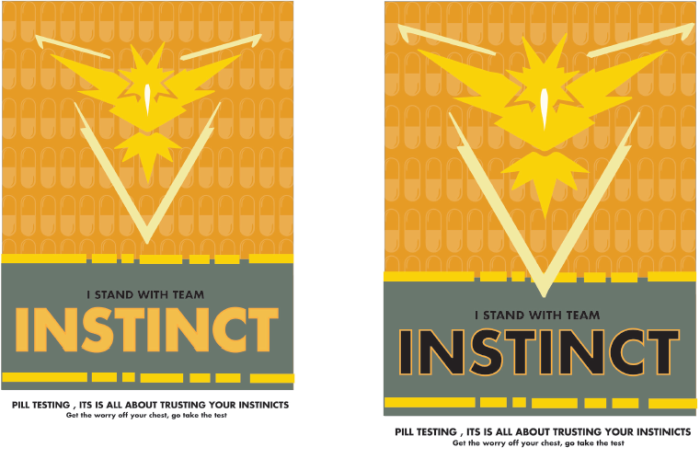
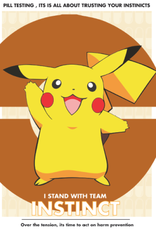
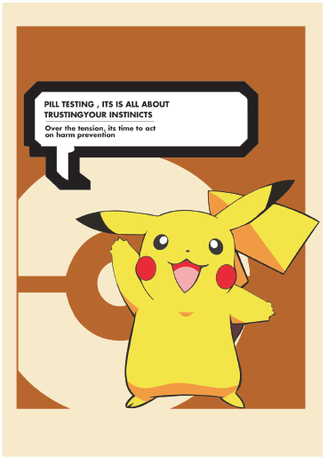
- Team instinct :They believe in trust and intuition, believing that Pokemon are excellent with their intuition,they represent the belief in oneself
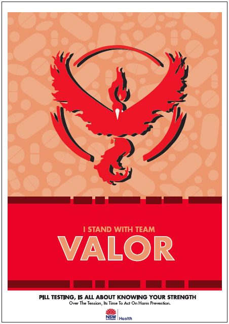
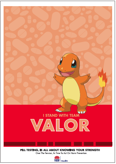
- Team valour : Their motto is to be the very best you have to train for it ,to gather knowledge and resources before gaining success , to pursue and know your strength , and perseverance.
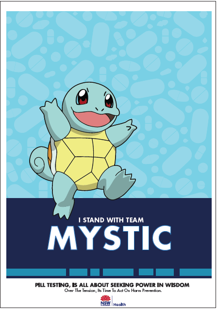
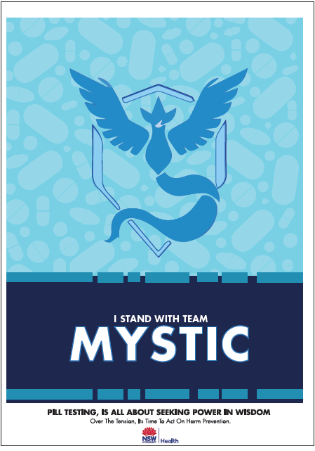
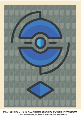
- Team mystic : Interested in evolution , the science behind what makes Pokemon tick , they are convinced that keeping calm is all it takes for success , that to seek power in wisdom
critical incident = choosing to design the poster campaign around the notion of the Pokemon team , rather then the icons found within the app.
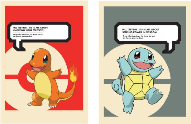
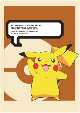
The Frist Prototypes:
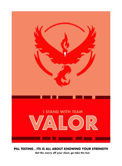
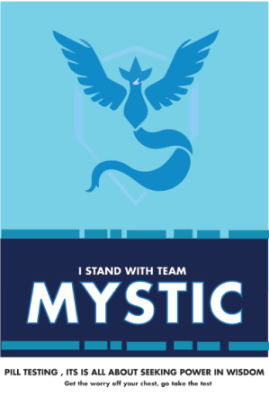
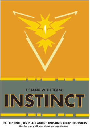
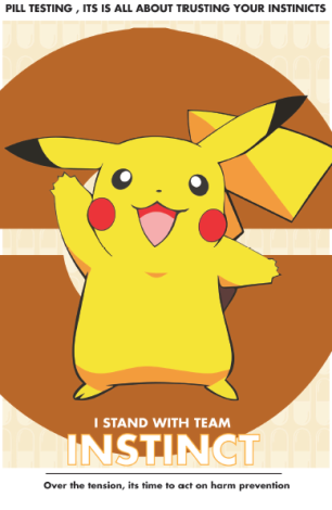
After creating quite a few copies of these style, it became clear that this style / design will work within my set brief . Though i want to further adapt on this design making sure to include capsules and pills , to highlight and reference the idea of pill testing ,making this more visible within each design.
Critical incident = adding the capsules into the background of the poster design , in order to bring reference to pill testing
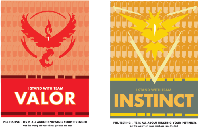
After further development , from the images from above it became evident for me to incorporate capsules into the posters, to emphasis the notion of drug abuses and pill testing, creating symbolisms within the image . This time i decided to take a different approach to the team posters, trying out different and new layouts.
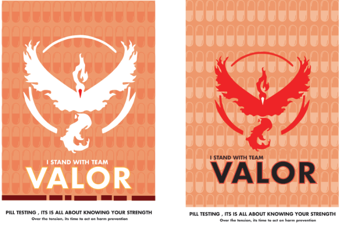
After looking back at the previous posters made , it made sense to fix and change my campaign copy. In order to focus the communication message back to the notion of harm prevention. Since this project is aimed to prevent further harm at festival grounds while teaching the general public. Changing from get the worry off your chest to > over the tension , its time to act on harm prevention. This campaign copy is making light of the situation of the general public worries concerning pill testing in Australian music festivals. This is because their have been so much concern and debate over the issue of pill testing.
From this , i went back to my first initial design and worked on them again.To see if i could improve their designs , with what i have previously designed. I wanted to incorporate the same themes and colour back into my posters , from this i decided to add back the original speech bubble. Bringing reference back to the original game of Pokemon. but after further develop it become clear that this design strategy wasn’t going to work as well as i thought it would
What Now ?
From here I will now finalize and choose to fix the chosen poster in order to make it fit within a social media environment, creating social media designs for instagram and snap chat filters.