Research and Process Summary report

*To access all my weekly blog post and design process in WordPress, they can all be found under the category CAGD390 tab which is located on the left hand side of the page. This was done in order to make the blog easier to access, having them all under one category – thank you *

Stage 7 learn-  (reflect)

Outline three primary references including their relevance (with at least one theoretical reference)

  1. Information Design -Kathryn Coates and Andy Ellison (2014)

Through “Information design” a design book written by Kathryn Coates and Andy Ellison (2014) prove to be a usual resources in regards to visualizing and communicating information through design artworks, providing hints and tips on the design process (Coates & Ellison, 2014,p.6). According to International Institute for Information Design (2014,p.10) they describe visual communication as the “planning and shaping of the contents of a message and the environments in which it is presented, with the intention to satisfy the information needs of the intended recipients” (cited by Coates & Ellison, 2014,p.10). Highlighting the importance of knowing who and what you are designing for, with the aim to making a clear and direct message (Coates & Ellison, 2014,p.18).

  1. Reading Pictures -David Crow (2003)

Reading Pictures’ (2003) a book by David Crow highlights the importance of a graphic designer to understand semiotics as an essential skill in designing. Highlighting the importance of designers finding “the right tone of voice or the right associations for a message”(Crow, 2003,p.56), playing with the concept of hidden set of meanings or messages signifying reality in a picture. The way we understand a message depends on how the language is being displayed, thus controlling how the viewer interprets the message and the tone of the language (Crow, 2003,p.56). Thus being an important factor in my design project, to create designs that clearly communicate the indented message through carefully selecting the right languages and images to use.

  1. Visual Thinking: For design -Colin Ware (2008)

Visual Thinking for Design demonstrates how design can be considered as tools for cognition. This book presents visual thinking as a complex process that can be supported in every stage using specific design techniques. This allowed me understand how visual thinking can impact your design, by thinking out of the square and not so straight forward, this primary research also helped in understanding the design process.


Describe 3 significant outcomes of your project: 

  1. Learning how to handle and produce large-scale design projects on a professional level.

This project has allowed me to acquire the right skills needed to produce and conduct a project on a large industrial scale. Allowing myself to produce the best quality of work I can, one that can be regarded as a professional standard. However working on a project of this scale, illustrated the importance of creating a project timeline. To ensure each design is met with the right amount of time to explore all options of the project, a technique that has been proved to be significant outcome of this design project.

  1. Designing for new platforms (Social media – SnapChat filters / Instagram feed)

This project allowed me to explore new options of design, allowing myself as a designer to think outside the box. By considering social media into this project gave myself access to create designs in a new way, a design that could be applied to modern technology through social media. Thus, impacting the way my project and visual communication message was applied to my design. Therefore becoming a significant outcome of the final major project.

  1. Learning new methods and strategies for an advertising campaign

Designing an advertising campaign proved to be a significant outcome of this design project. In order to have the right information and learn the right strategies and methods, I needed to conduct extensive research on what makes an advertising campaign so successful. By doing so, the research gathered allowed myself to learn the right tactics to use in order to make my project, an advertising campaign, a successful one. Allowing my project to reach a professional standard, something that wouldn’t happen without learning the right methods and strategies for an advertising campaign.


Describe how the design concept and final project is relevant to your career intention

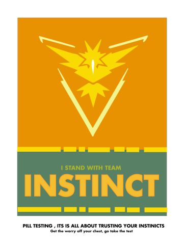
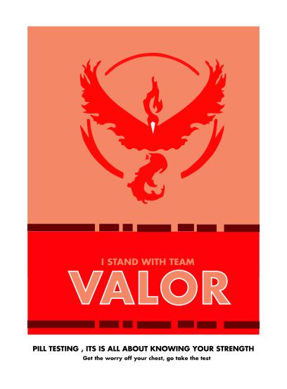
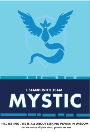
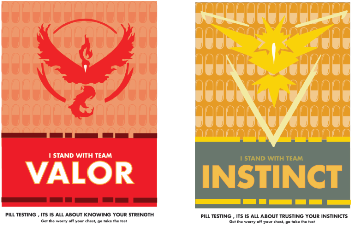
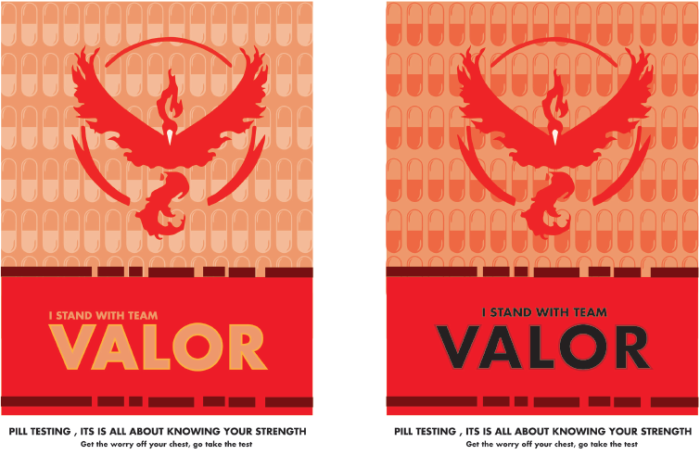
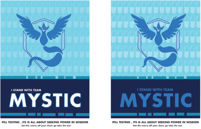
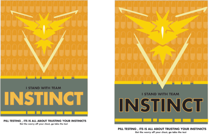
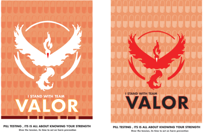
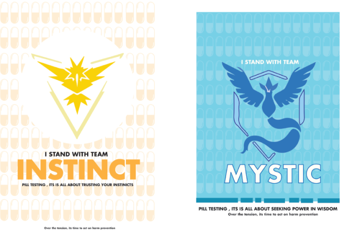
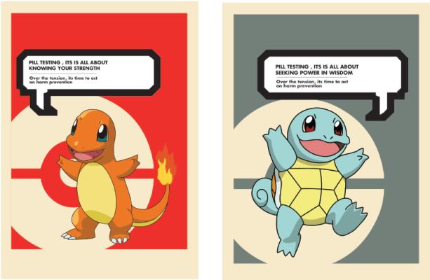
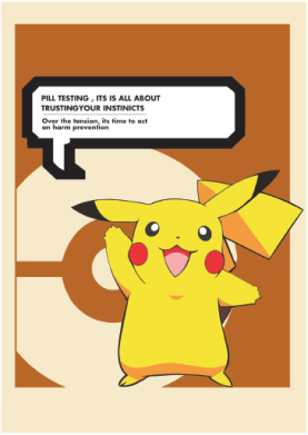
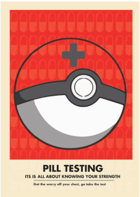
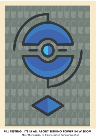
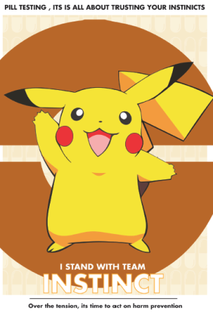
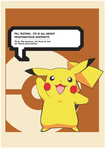
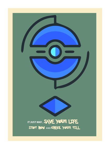
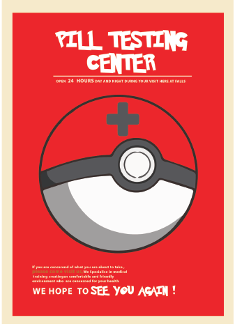
The chosen design concept and the final outcome of my project is relevant to my career intention. After graduation, I wish to work in a design firm that specializes in advertising and marketing, particularly through creative design campaigning. My major project highlights my talent to work within this industry, showing to future employees that I can handle industrial scale projects, while maintaining a professional level of advertising and marketing designs. Choosing the topic of pill testing demonstrates that I can tackle challenging topics within our society, particularly on design, marketing and advertising, while also meeting project deadlines. Showing that I am capable of working under pressure and succeeding. By producing posters and social media campaigns based on fantasy characters demonstrates my ability to push my design thinking, in order to think out side of the box. Thus displaying my skills to design on a professional advertising level, a quality that is needed in the design-advertising world.

References found within  Research and Process Summary : 


Wk 14 – Implementing Social media designs

This week is all about fixing my chosen social media designs, now that my posters series  are finalised, meaning i can add my posters into Instagram. This enables the campaign to have a home page , a place full of information. It also allows the campaign target audience to comment , like or share . The more times this is done within social media the more the campaign is spread around the public and festival grounds , an objective in which this project is sought to achieve.

Please find below the selected  / implemented Instagram designs

BCM240- Reflective Analysis

BCM240- Reflective Analysis

Creating a digital story project was changeling but also an awarding experience within this subject of BCM240, media, audience and place. The process of choosing a topic was long and tedious; though I knew I wanted to make sure that in order to meet all the essential criteria, I was choosing the right topic, and platforms available. Growing up in a generation so reliant on technology, particularly smart phones have always caught my interest. This modern technology has given us endless access to multiple platforms and various new skills. Everywhere you go, whether that be waiting on the bus or queuing in a line at a café and even in a classroom, people are addicted to the idea of using their smart phone. This has always caught my attention, particularly with the concern on what these smart phones may be doing to our society and within us. This led me choosing the subject FOMO, also known as, the fear of missing out. Framing my research question around the subject, Is FOMO Fueling your social media addiction?                                                                                                                                          

Methodology:

I chose to conduct my research by interviewing one person, in order to gain knowledge and insight in how a person can be affected by FOMO in their daily lives. The main objective of this project was to create a common connection between the interviewee and the viewer, particularly when watching the video through the chosen platform of iMovie. I found this method to be suitable for this topic, considering it is based on the idea of modern technology. The main objective of using this method was to make sure the viewer could understand the content of the video by including relevant sources.

Learning development /Challenges:

Through this assessment it become clear to me of Torsten Hagerstrand theory of restriction. Particularly when I found myself thinking, can I finish this project in time? , Can my interviewee make it on this day? , Will I have enough time to learn a new media platform with approaching deadlines? These were all concerns and challenges that surfaced within this project. Having an influence in the way in which I chose to conduct my digital story , making decisions in order to meet the project deadline.

During this assignment I have learnt a great deal about the platform iMovie in order to create a video, to be featured on my WordPress site. I knew I would have to challenge myself, in order to use the right platform for this project, one that would benefit my digital story. It is for that reason why I chose to challenge myself to gain new skills through IMovie. Allowing my project to be easily sharable and easy to access for followers found on my blog and for my interviewee to gain access to the final project, creating a sense of connectivity. This was illustrated through positive feedback and encouragement from my teachers and fellow class members. Using this platform has led me to discover that I have a key interest in filming, making this a platform in which I will choose to pursue in the future, as I find this process enjoyable.

However, I learnt when creating a digital project it’s a good idea to create a time schedule; this allowed me not to rush my project , having more time to learn the essential skills of IMovie and video making, this was proven to be difficult and long process. This showed my weakness of video editing, however this weakness enabled myself to establish problem-solving skills. If I was allowed more time and we weren’t restricted by a word count or time frame, I would like to peruse this project in the future with the notion of using more then one person for the interview. This would be interesting to see the different opinions on the matter of FOMO and social media, gaining different perspective on the topic, making it useful for future practices.

Usefulness to media industries:

Ethnography research is relevant to media studies and media industries. As stated by Ganti (2014) ethnography isn’t just about interviewing people, it’s about paying attention to the everyday life, to make an observation (Ganti, 2014). Its important to conduct an ethnographic approach to media production, it enables you to understand your audience and their culture making this an important and useful factor in media industries, a technique I ensured to use in my project. Focusing on the youth culture and how they viewed and watch content on social media. As Ganti (2014) illustrates, “Ethnography grounds the study of media in a specific time and space and offers insights into the process, possibilities, and constraints of media production”

 What I took away from completing this project:

The two most significant things that I took away from this project is understanding the importance of conducting relevant research and time management for a project this size. Researching and establishing questions before the interview, made the process of creating a story line easy to develop, which in return made the interviewee feel more relaxed. This enabled the film process to go smoother and quicker, which in return respects their time and wellbeing. Overall this project and subject, has taught me about the importance of media, audience and place, while also giving me the confidence to go and learn new skills that may be required within this degree or for future jobs in this field.


*Briefly I would like to thank my interviewee Ashleigh, who took some time out of her busy days in order for me to film and interview her for this project-Thank you *


References:

Ganti, T 2014, ‘The value of Ethnography’, Media industries journal, vol.1 no. 1, viewed 26th October 2016, <http://www.mediaindustriesjournal.org/index.php/mij/article/view/21&gt;.

wk 13- The final week of class – The selection / implementing of Snapchat Filters

This week is all about finalising my posters and social media designs for my project . Making sure I’m getting them right and ready for print next week (hopefully) . I talked to Angelina today and for submission Angelina said that i should include all my poster that have created to hand in , highlighting that this will show my whole progress , as she said its about telling a story of your project , not just the end result. During our discussion she emphasised that this project has the potential to be the beginning of a proposal document for the government if they wish to pursue the tactics of pill testing in Australia especially around music festivals , particularly in the summer seasons.

However , during class i finally found the right divisions for Snapchat and right photos to be featured at 300dpi , that i can use for when printing for submission and grad-show . I ended up using a selected few to be featured in the mock up in the iPhone , currently their are 20 mock ups of snapchat filters in which i chose to select 17 designs to showcase the Snapchat filters . One pop up ad and  within this week and next creating 2 x three instagram posts using the poster campaign.

Critical incident = Choosing how many snapchats will be needed to show for hand in and grad show . In order to show the two different designs. Secondly, finding the right dimensions and 300dpi images

Snapchat measurements  :

x=3028px

y=960px

w=1080px

h=1920px

Implementing Snapchat filters  

This week is all about fixing my posters doing the last touches , and getting submission document ready ! as well as fixing and editing the blog report 🙂 . Plus it will probably be a good idea to sort and look for a printing studio where they will be able to print my project for me , making sure that i don’t leave printing at the last minute.

wk 12- final touches / discussion

Today during class it was my chance to continue producing social media advertising for my project . With the main objective to make my campaign likeable and sharable among the target audience . To do this, my project is taking advantage of the resources Snapchat and Instagram to spread and access the desired audience for this project.However , this week in class i am working on creating snap chat filters, that are designed to be featured at the festivals grounds during the summer seasons. As a way for the average person to be apart of the campaign , in which they might stand for , advocate or even just advertise pill testing, in which they make the idea more known and comfortable within the public. Though what i have found while designing the filters , it soon became apparent to work within the right dimension of snapchat screen filters. It also became a critical incident when trying to locate the right photos to use for the mock up of the Snapchat filter. It became hard to locate photos that where of 300dpi ,  and didn’t have a water mark crossed across them. To progress further i will need to find the right  dimension of the Snapchat screen , in order to show the design for hand in week 15 and for the Gradshow.

I also have to keep in mind the closing due date that is fast approaching . I need to analyse if i may be taking too much on bored ,particularly when designing too many social media creations.So far i have also focused my attention down to six poster for submission in week 15 .

Critical incident = Not having the right dimension needed for Snapchat filters or finding the right photos for the background image. Changing from the hash tag to taking away the hash tag , in the main tag line. Thirdly , adding the second tag line to the filter .

Please find below the first prototypes of my  SnapChat filters. 

By creating these snapchat filters allows the audience to feel connected and involved , giving them the opportunity to chose a team to participate within , using these filters when taking a photo at the festival grounds , to show their supper  , or even jus to use these design because they like the characters or teams. Either way the message behind to spread around the festival grounds and the general public.

During class i created the idea of using a pop up ad in the actual Pokemon game ,to feature the campaign communication message of pill testing. This gives the project a connection between the game and the campaign, which in return enables the project to reach a wide variety of audiences into the campaign.I ran with the same idea of using the pokemon teams to highlight the qualities of pill testing , as they do share the same notion .This also captures the attention of the audience in which they might relate too as well. The pop up ad incorporates , the the campaign tag line and the team logos.

screen-shot-2016-11-05-at-11-00-32-pm

Instagram was also created , though it was proven to be difficult to make a mock up with the poster already made , this will take more time , something i will have to continue during this week and the next , in order to get it right with the best quality possible for printing.

Grad-show Thoughts 

I want to display my poster design , particularly my team designs and character design , i just need to figure out what social media designs should i display and how many ? when i currently have 20 snapchat filters created  , this will require further thinking , particularly cost and materials , at this moment I’m thinking of using a magnetic system !

Week 11 – Interim feedback(Select stage)

In week 11 we were giving the task to present our designs that are up to the select stage of the design thinking process by Ambrose and Harris . With the main aim to gain advice on what is needed to be approved upon , ready to handed in for week15 due date. After presenting all my designs that where created over the last serval weeks. Below is the following feed back received from both Gregor and Angelina


  • it was commented that my process shows a  Such comprehensive journey will have lots of visual impact.
  • commenting that for the grad show in my case the more designs i show of my process the better “The more on display the better!We want to present stuff that is comprehensive, the top 40 hits”.
  • they commented that working within the Pokemon teams was a clever idea claiming “Working in teams and characters with tagline have helped a lot”.
  • they said the next step now is just to and selected my best design design and Simply fine tuning kerning, scale and proportion.
  • They also commented that my next act is to add a Social media dimension- shareable gifs, memes, pop up characters and posters within Pokémon go. Now what can I really do with them in terms of social media- have fun! . stating that its clever and fun
  • Focus now on refining graphic elements. Presentation works well as basis of final report.
  • WOOHOO OUTSTANDING! approach

After this response i  decided on selecting the designs on the teams and character design , with the capsules in the background. After presenting these ideas it became clear that this design strategy was the   most effective and worked with the design brief . From here i will now implement my design so they are perfect . Once this is done i will now create and design social media aspect to this project , creating a fun sharable environment with a very important message.

Critical incident = Adding a shadow effect on the team logos , while also changing the opacity of the capualues in the background on the posters. Thirdly playing with the  colour of text , to match the background colour.


WK – 10 Prototype

After designing the posters featuring the team designs , it occurred to me to keep pushing my design thinking further to explore all aspects of my design concept. It soon became clear to me to to include the pokemon characters back into the posters , with the main heading “i stand with team ….” . I thought that this would create a more relatable and catchy advertisement for the target audience in order to capture their attention. Incorporating Pokémon characters into the team poster designs,making them mascots , creating a connection towards the campaign.Im thinking about using the different  characters to represent different popular festivals drugs found at the grounds,  for instances using Pikachu = ecstasy, Squirtle= ice , Charmander= LSD ? is a potential thought / idea.

Critical incident   = Changing the posters to include the characters into the team design , in order to create symbolism between viewer, pokemon and pill testing. sSecondly adding capsules back to original designs ,using the characters.

Character Prototypes

After designing three characters posters , i knew something was missing from the background . I decided again to bring back the pill capsules , in order to bring reference back to the notion of pill testing , creating a link between the two themes.

Prototype two of characters screen-shot-2016-11-05-at-9-31-58-pmscreen-shot-2016-11-05-at-9-31-47-pmscreen-shot-2016-11-05-at-9-31-36-pm

Mid recess break (design – prototype) & week 10

During this week break (mid session – recess) my main aim was to create and work on my previous draft posters , constantly making sure I’m evolving my designs , making the type and illustration elements work together.  I decided to use the same colours and style keeping with the vintage feel within each design. The first step before creating any more poster design or images ,  as suggested by Gregor  , was to work on developing campaign copy , making sure the copy related to the main idea of Harm prevention and pill testing in Australia . The following phrases below are campaign copy i brain stormed.

  1. Stop, think and test
  2. test can save your life,give it a chance
  3. the test is best , don’t listen to the rest
  4. push for the test , heck lets just say yes
  5. stop the harm , its time to accept a pill checking test
  6. why risk it , when you can test it
  7. Be brave, be smart, get real, drug testing can save lives
  8. Pill testing isn’t a radical idea, its basic harm reduction
  9. Make an informed choice, choose to test
  10. No more overuses, there is no more excuses
  11. Over the tension, its time to act on harm prevention
  12. Do what’s best, come do a pill test
  13. Can I have your Attention, pill testing can be a way for harm prevention
  14. Don’t stand still, just go and test your pill
  15. Get the worry off your chest, go take the test


After further evaluation of the phrases i came away with two standouts that i believed would stand out within the project and relate well with the design and project aim. These are :

  1. Get the worry off your chest, go take the test
  2. Over the tension, its time to act on harm prevention

Critical incident = choosing to change the sub tag line , in the poster campaign , to “over the tension , its time to act on harm prevention”

From here i made different version for the poster campaign , making sure to explore all the different aspects of the same theme. After intensive research it became clear that using just the game icons found within the game of Pokemon wasn’t going to work properly , so i decided to step away from this idea (as found below).


As a result I went back to researching more about the game .This is where i came across a few websites that started talking about the different teams in the Pokemon go app . As i kept reading their site , they author started talking about what team you as a player should chose. In the game their are three teams available in which you as the player can choose from.  While doing so different  blog post, kept popping up regarding what teams to choose when playing the game . From reading the team qualities from a few blog post  , it suddenly became clear that i could potential use the Pokemon teams in order to relate their qualities to pill testing. That maybe i could combine these two elements giving me  me the main text and colour scheme for the poster , while incorporating the one of the two phrases above.

The Three teams

  1. Team instinct :They believe in trust and intuition, believing that  Pokemon are excellent with their intuition,they represent the belief in oneself
  2. Team valour : Their motto is to be the very best you have to train for it ,to gather knowledge and resources before gaining success , to pursue and know your strength , and perseverance.
  3. Team mystic : Interested in evolution , the science behind what makes Pokemon tick , they are convinced that keeping calm is all it  takes for success , that to seek power in wisdom

critical incident = choosing to design the poster campaign around the notion of the Pokemon team , rather then the icons found within the app.

The Frist Prototypes: 
beginning-2-01
beginning-2-03-copy

screen-shot-2016-11-05-at-8-58-44-pm

screen-shot-2016-11-05-at-9-01-03-pm

After creating quite a few copies of these style, it became clear that this style / design will work within my set brief . Though i want to further adapt on this design making sure to include capsules and pills , to highlight and reference the idea of pill testing ,making this more visible within each design.

Critical incident  = adding the capsules into the background of the poster design , in order to bring reference to pill testing

screen-shot-2016-11-05-at-9-03-27-pmscreen-shot-2016-11-05-at-9-03-18-pmscreen-shot-2016-11-05-at-9-03-08-pmscreen-shot-2016-11-05-at-9-02-57-pm

After further development ,  from the images from above it became evident for me to incorporate capsules into the posters, to emphasis the notion of drug abuses and pill testing,  creating symbolisms within the image .  This time i decided to take a different approach to the team posters, trying out different and new layouts.

screen-shot-2016-11-05-at-9-18-33-pmscreen-shot-2016-11-05-at-9-18-21-pm

After looking back at the previous posters made , it made sense to fix and change my campaign copy. In order to focus the communication message back to the notion of harm prevention. Since this project is aimed to prevent further harm at festival grounds while teaching the general public. Changing from get the worry off your chest to > over the tension , its time to act on harm prevention. This campaign copy is making light of the situation of the general public worries concerning pill testing in Australian music festivals. This is because their have been so much concern and debate over the issue of pill testing.

From this , i went back to my first initial design and worked on them again.To see if i could improve their designs , with what i have previously designed. I wanted to incorporate the same themes and colour back into my posters , from this i decided to add back the original speech bubble. Bringing reference back to the original game of Pokemon. but after further develop it become clear that this design strategy wasn’t going to work as well as i thought it would

screen-shot-2016-11-05-at-11-03-55-am      screen-shot-2016-11-05-at-11-03-38-am                    screen-shot-2016-11-05-at-11-03-28-amscreen-shot-2016-11-05-at-11-03-23-amscreen-shot-2016-11-05-at-11-03-15-amscreen-shot-2016-11-05-at-9-46-33-pm


What Now ?

From here I will now finalize and choose to fix the chosen poster in order to make it fit within a social media environment, creating social media designs for instagram and snap chat filters.


Week 9-The first drafts (ideate stage)

This week i created three posters draft of Pokemon icons and characters in my ideate stage , these conisted of:

1. Pikachu, the idea to corporate characters as a way for the target audience to relate to the campaign and to create a comfortable push towards pill testing.beginning-10-01

2. The Pokestop – a way to highlight to festivals goers where they might find pill testing locations or areas that contribute to pill testing , a way for festival goers to find a pill testing centre

beginning-10-02

3. Pokeball – To illustrate health centres found on the festival grounds, with the aim to make the pill testing centre inviting for an individual to visit the centre without fear. By using the poke ball creates a connection between viewer and Pill testing. In a fun inviting way

screen-shot-2016-11-05-at-9-40-50-am

4. A redesign of the first draft- The aim of this was to make the character Pikachu look like a ninja , a person who fight crime agaisnt drugs . I was looking to see if i could this character as a advocate for pill testing.

screen-shot-2016-11-05-at-9-41-04-am

After showing these design and ideas to Gregor it was suggested that i need to think about the characters and how they relate to pill testing eg. creating characters to be put under the heading of different drugs that are found at festivals or under the idea of “Pokemon pill testers” when using these characters. He explained that in order to move forward i needed to think about the idea of pill testing within these poster designs and how they relate to one another . When mentioning i wanted to included the old vintage style of the Pokemon game with the idea of the speech bubble reference , he advised me that i needed to think about this whole concept more focusing on the image and the text separately ,and once this is achieved it will be easy for me to bring the whole design elements together. He stated that i needed to work on campaign copy first then move forward and try make that work with the images before anything else can be achieved .Gregor enjoyed the colours and the style that i was aiming for but he just wants me to work on the way the text and choice of type is presented , highlighting that this needs to be followed through all design in the poster campaign.

It was brought to my attention to extended my project to social media device in order to spread the message across and make this project shareable across Gen Y and X. Gregor suggest using these Pokemon icons and character and producing memes through social media / banner on instagram.

From here i will work more on my design of my posters getting the type and illustration right before moving on , while researching and designing memes or other social media ideas for the aim of making this project shareable . Plus the use of snapchat, within my project

Critical incident = making sure that my posters have a tie to pill testing , making a reference or a common connection between the two themes. Secondly, the need for better campaign copy .