Stage 4 , 5 ,6 & 7 – wk 5

Stage 4- Prototype
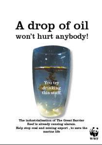
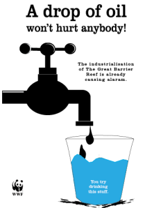
“A prototype gives the design team and clients the ability to visualise and handle a design concept , to get an feel of its physical presence and tactile qualities “( Ambrose & Harris , 2010). My final three chosen where selected from my ideate process. They are;
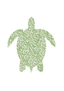
1.  Typography turtle
2.The cup with a drop of oil
3. leaking tap
These three choices for the design poster were refined to display detail to the suited brief . They both represent climate change in the great barrier reef, all have their own message , are able to communicate clearly then the other design options and are able to represent WWF.

Screen Shot 2014-09-23 at 8.48.13 pm

Screen Shot 2014-09-23 at 8.48.36 pm

Screen Shot 2014-09-25 at 4.24.56 pm

Stage 5-Select 

“The select stage is the point at which one of the proposed design solutions
is chosen for development. The key decision criterion is fitness for purpose: does the design meet the needs and goals of the brief, and will it effectively communicate to the target audience to achieve those aims”(Ambrose & Harris,2010).  I have selected the third design from my prototypes. I believe that this design reflects the brief of climate change and suits my client and their audience. Drawing notice to industrialization in the Great Barrier Reef with contributes to climate change. Focusing on coal and mining exports travelling through the reef that causes damage through oil, water pollution, raising of temperature all they affect and kill the reef. I have refined this in 3 different ways, with different design elements. This enables the client to choose 1 they think represent their label, company image and defines the brief the best. It’s a design that is easy to display and won’t take up to much time prior and communicates efficiently

Stage 6 & 7 – Implement and Learn
“During this stage, the designer passes the design artwork and format specifications to those who will be supplying the final product.”(Ambrose & Harris , 2010).

The poster will be printed onto an A3 size paper. This will make it efficient for the client to hang up and copy more if desired. What I learnt was to take my the time to smooth the edges around the cup so they are more defined, As I designer I learnt the importance about the display of a typeface and the way we position a design on a poster. The feedback we received from students and teacher that help assists and diagnose problems within a design.

Learn;
“The final stage in the process involves learning from what has happened throughout the design process” (Ambrose & Harris , 2010)
Stage 3: ideate continue wk4

Design 6: 

IMG_1685.JPG

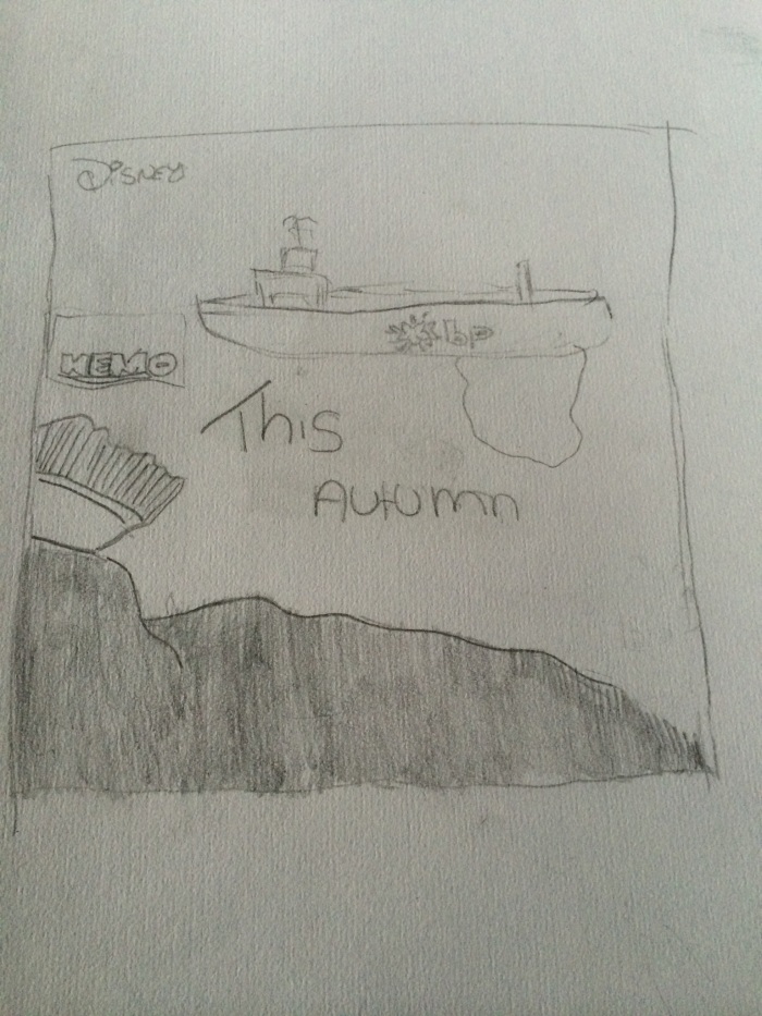
This design poster also plays with the idea of using the Finding memo movie poster and making a parody out of it . This sketch has used the backdrop of on of Nemo poster of the great barrier reef but has now added the element of the oil ship leaking through the reef . The target audience again is aimed at Families and children , from the client WWF  .

Design 7 :

IMG_1687.JPG

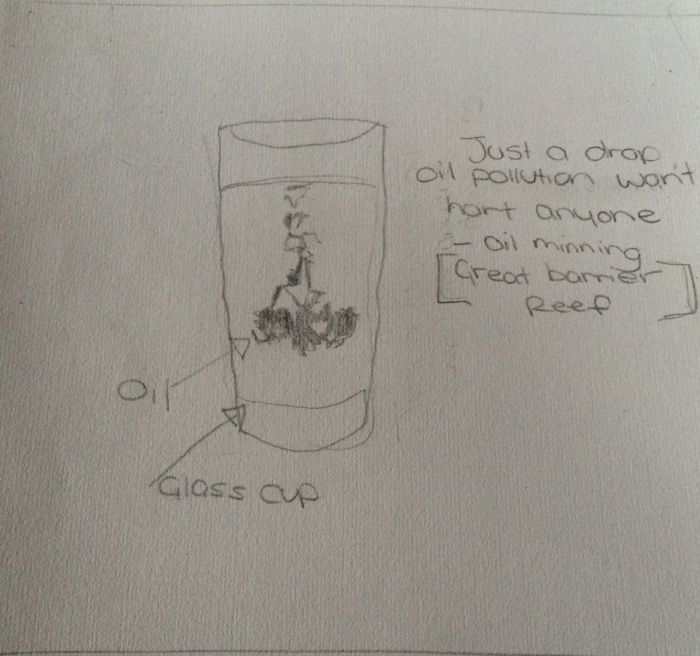
This poster features a cup with a drop of oil moving through the water , this image was inspired from the WWF campaign to the target audience of the general concern public . To grab attention , its slogan is Just a drop of oil never hurt  anyone- oil Mining [ Great Barrier Reef ] . making the audience  apply  their  knowledge that we know that oil is harmful to us if we consume it ,  so why would we make our marine life suffer from it .

Design 8 :IMG_1686.JPG

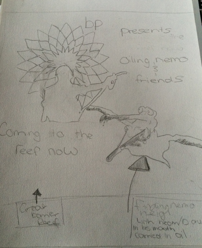
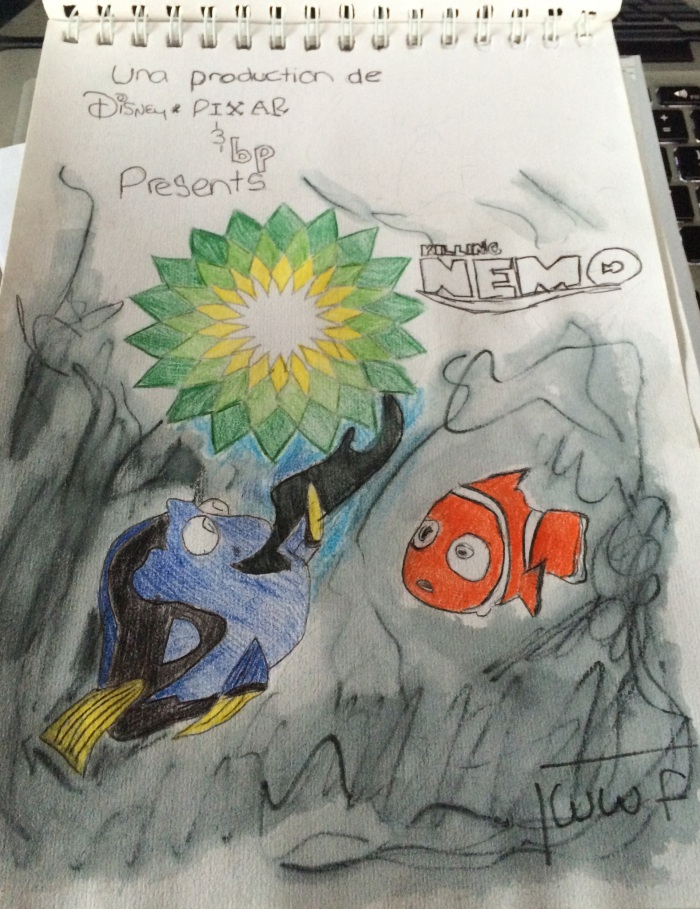
This poster features the logo of bp with a shadow of a man standing in front holding a pump pouring oil on top of the marine animals and wildlife. This image also takes on a parody of movie of Finding Nemo featuring familiar character which again attract the target groups of children and families.

Design 9  :

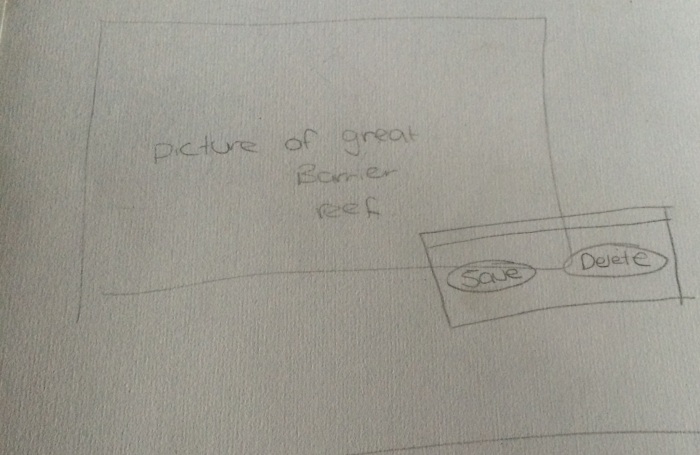
IMG_1690.JPGThis poster shows an image of the great barrier reef in a postcard design layout  showing the lovely reef and the people snorkelling in the world heritage reef . But overlaying the image of the postcard is the the tab button on a computer to “save” or “delete” this will appeal to the target market of teenagers and older who are well equipment with computers and will understand the visual message.

Design 10 :

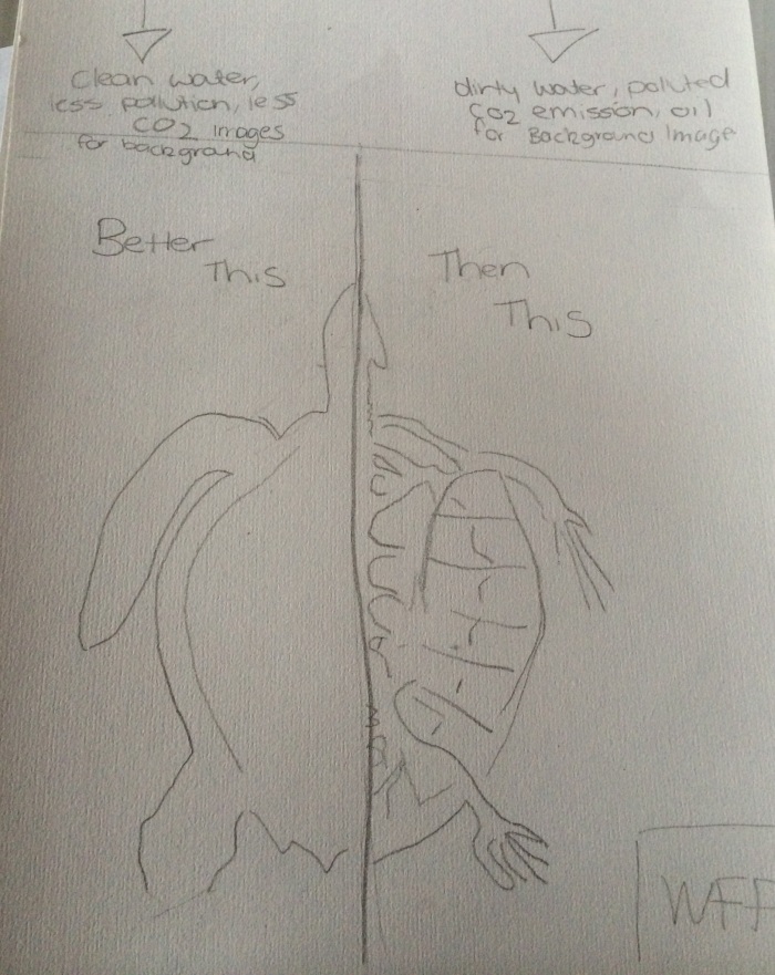
IMG_1691.JPGThis design poster shows to sides of a turtle the left side portraying clean water , less co2 emissions and less pollution display behind the health turtle , with the slogan “Better This” . While on the right side of the poster is the skeleton of a turtles who has suffered from climate change. In the background behind the dead turtle is images of co2 emissions , polluted water , oil spills .  With the slogan “Then This ” . Target  audience is family  members and general  public , environmental groups.

7 design process-wk 3

stage 3 : Ideate – The creation of ideas and potential designs. i choose to approach this process using sketches as a method to demonstrate my ideas for the Poster for the Great Barrier Reef. We as a class where told to create 10 ideate types to present our concepts for our clients.

Design 1:

IMG_1680.JPG
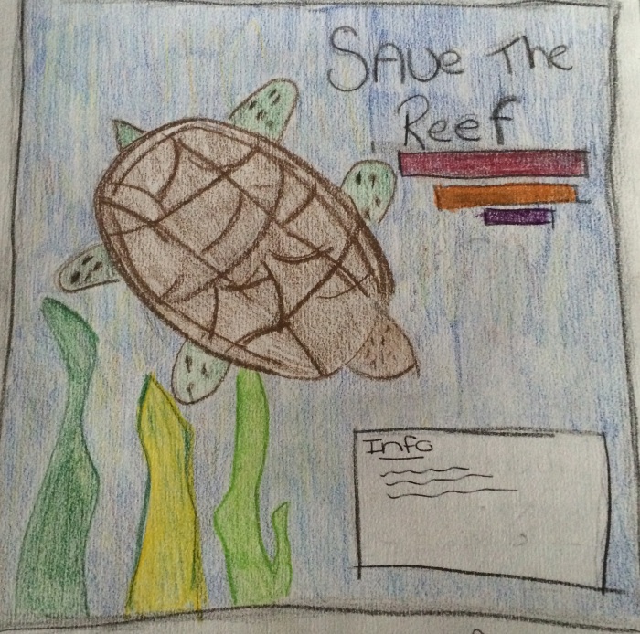
– awareness poster from the client WWF. Connecting with the marine animals in this case a turtle and playing with the audience knowledge ( general concerned public /children) and their connection to the animal . information located at the bottom of the poster stating information about climate change and how to help .

Design 2 :

IMG_1683.JPG

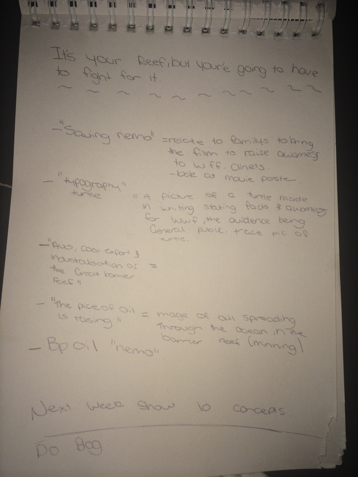
Taking on a parody of the finding Nemo movie poster, to depict how the animal are suffering in The Great Barrier Reef due to pollution and Mining near the reef with the affects of oil spills . The target  Audience is designed  for families and children  to gain knowledge and feel a connection to the characters and The Great Barrier Reef in a way they will understand and Present a clear visual message. Using the bp petrol logo with the parody of Finding Nemo , which instead says Killing Nemo .

Design 3 :

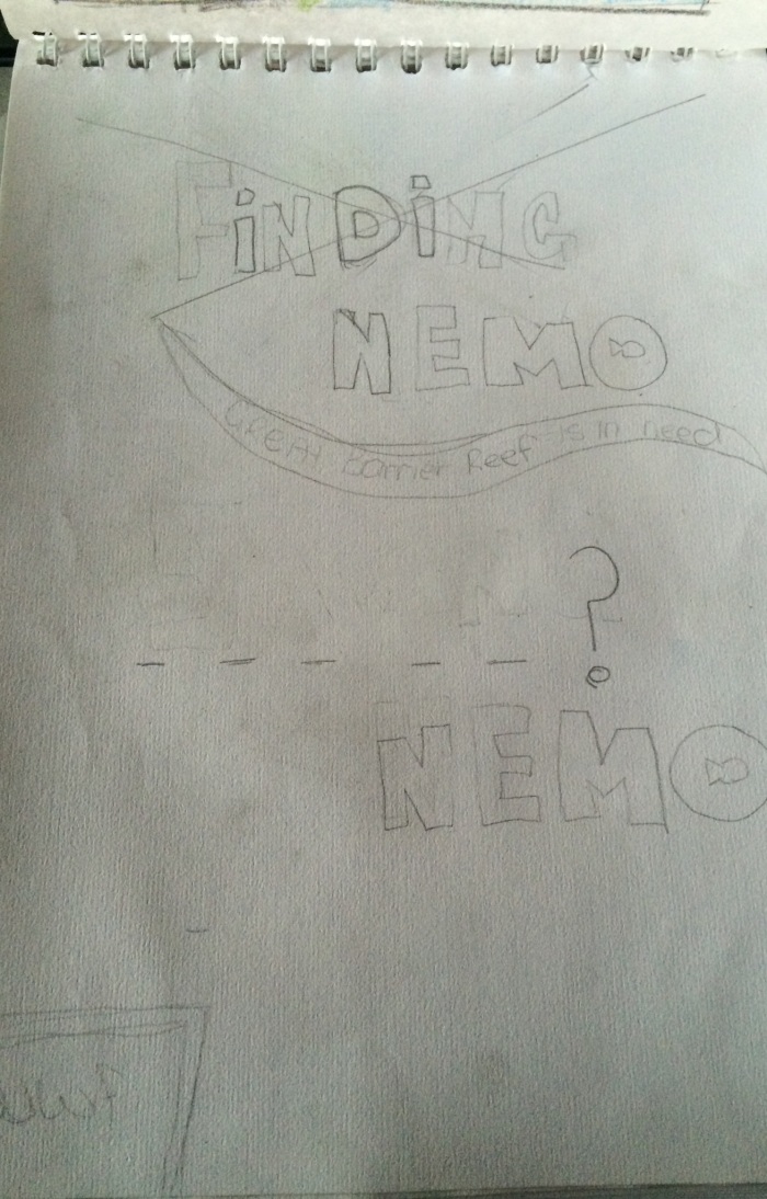
This poster is looking at the Typography text of the well known “Finding Nemo”. at the top of the poster you have the word “Finding” with a visual representation of a cross going through the word , while at the bottom of the poster , erasing the word finding and place doted lines to portray what happened to memo if we don’t do anything to stop climate change affects . IMG_1681.JPG

Design 4 :IMG_1682.JPG

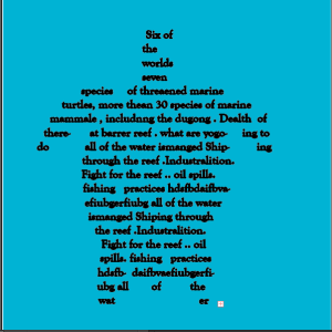
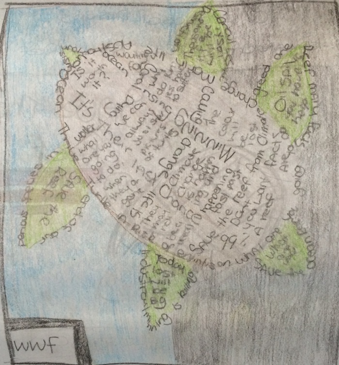
In this main poster i am focusing on using the image of the turtle the centre image , making the turtle out of facts about climate change on The Great Barrier Reef using typography. while displaying the background either in a good light (blue) or evil light (black)

Design 5 :

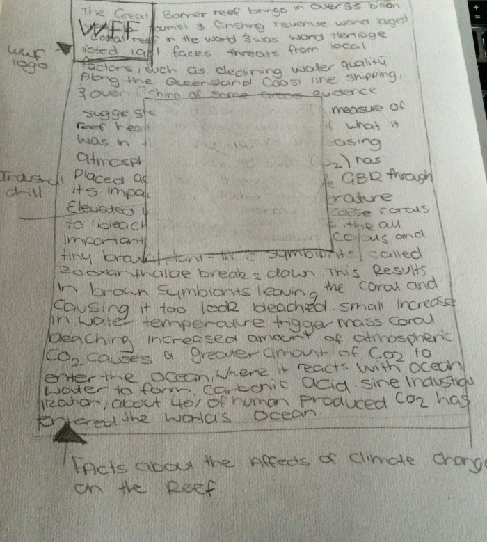
IMG_1684.JPGThis poster also looks at the facts of climate change on the reef by adding information  to the back ground while putting the main image in the centre  of the poster , using an image of a mining drill .

Mood board – Stage 2 Research wk2

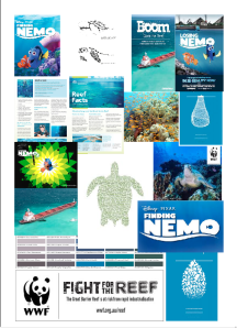
Part of the design process , focusing on the research stage i have finally been able to create my mood board Of graphics which have inspired me such as the colours to use , images and information about climate change at The Great Barrier Reef . I have also looked at other designers creations in order to grab inspiration from them and see the competition . The following image bellow is my mood board for climate change poster in the great barrier reef for my client WWF.

Screen Shot 2014-09-03 at 12.22.45 PM

7 stage design process- wk 1&2

For this assessment task we are asked to Use the Ambrose & Harris 2010 design process , to follow these steps to create our design poster.
1. Define- The problem and context

Client: WWF (World Life Fund for nature) is an international non- government organization working on climate, sustainability, habitats and Species. They become my inspiration and gave me a brief to create a visual poster for climate change on the Reef.


Client Brief: To create a design campaign that informs WWF audience to notice the affects of climate change on the Great Barrier Reef and to suggest the impact of human pollution that contributes to climate located at the reef. To be presented in a poster that can be displayed around communities, schools and buildings. A design that promotes changes and is suitable for WWF identity, Is easily recognizable to their audience and present a visual piece that communicates and reflects their environmental campaigns. A design that is meant to shock the public but is also to present a friendly, positive action plan.


Audience: The target audience is mainly design for teachers, concerned general public and environmental marine groups

Stage 2 : Research – The creation of ideas and potential designs 

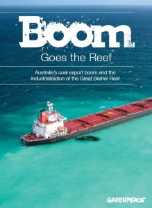
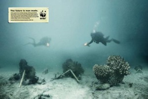
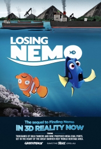
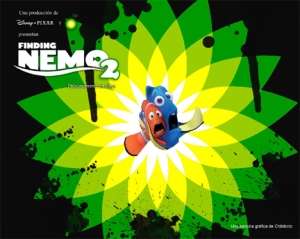
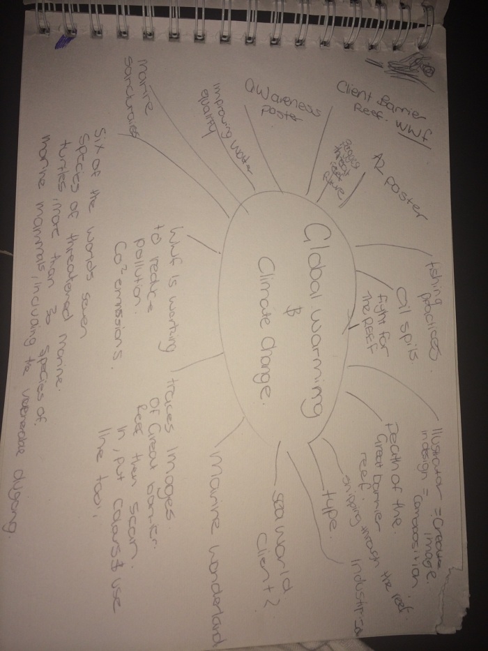
I chose to research current issue of client change on the Great Barrier Reef, looking at the issue that damage the Reef in order to create and design the Poster for WWF (World wildlife funds). I looked at Facts about the Great Barrier Reef, to decide which issue was so important to visually express. The information was found on the Australia government on climate change affects on the Great Barrier Reef and client WWF. While researching I discovered that co2 emissions affected the water temperature causing the temperature to rise, which affects the reef coral and animal species as it cause coral bleaching. They also stated the man made pollution is a contributing factor to climate change, e.g. Oil and coal mining. WWF webpage also targeted outdated fishing practices and Industrialisation, with the Queensland government increasing shipping through the narrow straits between the reefs and the development of worlds biggest coal port, 50km away from Whitsunday islands. With these facts I wanted to design a poster around this particular issue that is affecting the Reef. Looking at primary and secondary research from previous campaigns from WWF, Greenpeace and general environmental artist who have done similar campaigns about saving The Great Barrier Reef. I looked at ways I wish I could manipulate and gather ideas on how to compete and make mine suitable to my client image of their campaigns that matches their audience.

Examples:

http://takvera.blogspot.com.au/2012_03_01_archive.html


http://theinspirationroom.com/daily/2006/the-future-is-man-made/


http://www.circul8.com.au/social-media-upd8-email/greenpeace-circul8-generate-one-million-reasons-to-save-the-great-barrier-reef/
http://www.disclose.tv/forum/finding-nemo-2-parody-posters-inspired-by-oil-spill-t75849.html
http://alicereynolds14.wordpress.com/2013/03/04/creating-typography/

IMG_1626.JPG

IMG_1627.JPG

The final assessment

The girls and i today handed in our final assessment  for CAVA101 & CAVA102 . We were able to fix and glue a few things down today just before we handed the 2 Zines in to remark by our lecturer. overall I’m so happy with what Nisha , Tara and i completed with this assessment task, It was a privilege to work with them. We were able to effectively work as a team and become very good friends. We had excellent communication and were willing to help each other out when needing to , it was easy to work beside them and i would gladly do it again . 

Zine progress

Over the weekend we found out that our initial plan to complete the zine had changed , when we found out that we only needed to make two Zines to hand in. Thus leaving Nisha to finishing printing the zine pages and places them on the page , for us as a group to paste down  tomorrow morning before we hand them in at 10-11am on monday. Our original plan was that tara would take 2 , i had three and Nisha would do the two zines that we wanted to hand in. We were going to make 7 Zines , but realising that we only had to do 2/3 we decided to scrape the others. Which Nisha didn’t mind doing , and very grateful for her printing. Though Tara and i will very much help tomorrow morning to fix the final touches.