Assessment Three -Reflective Report-CAGD390


Please find attached below my reflective report for Assessment three, if you have any problems accessing the PDF , please contact me through email in order to send a pdf version your way 🙂

reflective-report

Approx : 2300 words

References:

  • Crow, D 2003, ‘READING PICTURES’, Creative Review, vol. 23, no. 11, pp. 54-57.
  • Ambrose, G, & Harris, P 2015, Design thinking for visual communication, Bloomsbury publishing, London

Wk 14 – Implementing Social media designs

This week is all about fixing my chosen social media designs, now that my posters series  are finalised, meaning i can add my posters into Instagram. This enables the campaign to have a home page , a place full of information. It also allows the campaign target audience to comment , like or share . The more times this is done within social media the more the campaign is spread around the public and festival grounds , an objective in which this project is sought to achieve.

Please find below the selected  / implemented Instagram designs

wk 13- The final week of class – The selection / implementing of Snapchat Filters

This week is all about finalising my posters and social media designs for my project . Making sure I’m getting them right and ready for print next week (hopefully) . I talked to Angelina today and for submission Angelina said that i should include all my poster that have created to hand in , highlighting that this will show my whole progress , as she said its about telling a story of your project , not just the end result. During our discussion she emphasised that this project has the potential to be the beginning of a proposal document for the government if they wish to pursue the tactics of pill testing in Australia especially around music festivals , particularly in the summer seasons.

However , during class i finally found the right divisions for Snapchat and right photos to be featured at 300dpi , that i can use for when printing for submission and grad-show . I ended up using a selected few to be featured in the mock up in the iPhone , currently their are 20 mock ups of snapchat filters in which i chose to select 17 designs to showcase the Snapchat filters . One pop up ad and  within this week and next creating 2 x three instagram posts using the poster campaign.

Critical incident = Choosing how many snapchats will be needed to show for hand in and grad show . In order to show the two different designs. Secondly, finding the right dimensions and 300dpi images

Snapchat measurements  :

x=3028px

y=960px

w=1080px

h=1920px

Implementing Snapchat filters  

This week is all about fixing my posters doing the last touches , and getting submission document ready ! as well as fixing and editing the blog report 🙂 . Plus it will probably be a good idea to sort and look for a printing studio where they will be able to print my project for me , making sure that i don’t leave printing at the last minute.

wk 12- final touches / discussion

Today during class it was my chance to continue producing social media advertising for my project . With the main objective to make my campaign likeable and sharable among the target audience . To do this, my project is taking advantage of the resources Snapchat and Instagram to spread and access the desired audience for this project.However , this week in class i am working on creating snap chat filters, that are designed to be featured at the festivals grounds during the summer seasons. As a way for the average person to be apart of the campaign , in which they might stand for , advocate or even just advertise pill testing, in which they make the idea more known and comfortable within the public. Though what i have found while designing the filters , it soon became apparent to work within the right dimension of snapchat screen filters. It also became a critical incident when trying to locate the right photos to use for the mock up of the Snapchat filter. It became hard to locate photos that where of 300dpi ,  and didn’t have a water mark crossed across them. To progress further i will need to find the right  dimension of the Snapchat screen , in order to show the design for hand in week 15 and for the Gradshow.

I also have to keep in mind the closing due date that is fast approaching . I need to analyse if i may be taking too much on bored ,particularly when designing too many social media creations.So far i have also focused my attention down to six poster for submission in week 15 .

Critical incident = Not having the right dimension needed for Snapchat filters or finding the right photos for the background image. Changing from the hash tag to taking away the hash tag , in the main tag line. Thirdly , adding the second tag line to the filter .

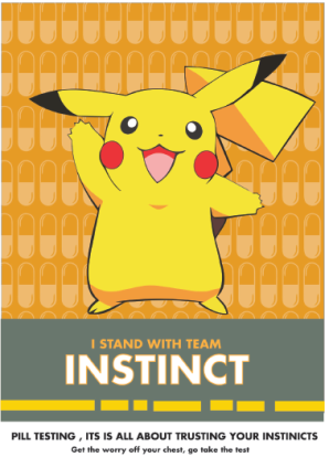
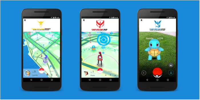
Please find below the first prototypes of my  SnapChat filters. 

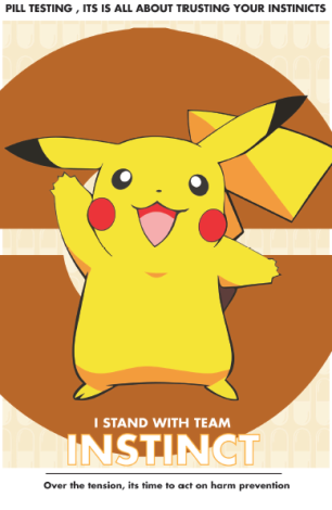
By creating these snapchat filters allows the audience to feel connected and involved , giving them the opportunity to chose a team to participate within , using these filters when taking a photo at the festival grounds , to show their supper  , or even jus to use these design because they like the characters or teams. Either way the message behind to spread around the festival grounds and the general public.

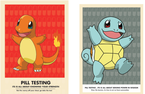
During class i created the idea of using a pop up ad in the actual Pokemon game ,to feature the campaign communication message of pill testing. This gives the project a connection between the game and the campaign, which in return enables the project to reach a wide variety of audiences into the campaign.I ran with the same idea of using the pokemon teams to highlight the qualities of pill testing , as they do share the same notion .This also captures the attention of the audience in which they might relate too as well. The pop up ad incorporates , the the campaign tag line and the team logos.

screen-shot-2016-11-05-at-11-00-32-pm

Instagram was also created , though it was proven to be difficult to make a mock up with the poster already made , this will take more time , something i will have to continue during this week and the next , in order to get it right with the best quality possible for printing.

Grad-show Thoughts 

I want to display my poster design , particularly my team designs and character design , i just need to figure out what social media designs should i display and how many ? when i currently have 20 snapchat filters created  , this will require further thinking , particularly cost and materials , at this moment I’m thinking of using a magnetic system !

WK – 10 Prototype

After designing the posters featuring the team designs , it occurred to me to keep pushing my design thinking further to explore all aspects of my design concept. It soon became clear to me to to include the pokemon characters back into the posters , with the main heading “i stand with team ….” . I thought that this would create a more relatable and catchy advertisement for the target audience in order to capture their attention. Incorporating Pokémon characters into the team poster designs,making them mascots , creating a connection towards the campaign.Im thinking about using the different  characters to represent different popular festivals drugs found at the grounds,  for instances using Pikachu = ecstasy, Squirtle= ice , Charmander= LSD ? is a potential thought / idea.

Critical incident   = Changing the posters to include the characters into the team design , in order to create symbolism between viewer, pokemon and pill testing. sSecondly adding capsules back to original designs ,using the characters.

Character Prototypes

After designing three characters posters , i knew something was missing from the background . I decided again to bring back the pill capsules , in order to bring reference back to the notion of pill testing , creating a link between the two themes.

Prototype two of characters screen-shot-2016-11-05-at-9-31-58-pmscreen-shot-2016-11-05-at-9-31-47-pmscreen-shot-2016-11-05-at-9-31-36-pm

Week 9 – The creation of the Characters

screen-shot-2016-11-04-at-11-56-30-pm

During the weekend i spent some time creating these characters for my poster campaign. I wanted to use Pokemon characters that where highly recognisable , within the chosen target audience. After some research and from playing the game myself i knew these characters where the most known and sought after characters of the game. The bonus of these characters is that they all belong to different teams within the game of Pokemon. However my first idea was to use their colour as a way to represent different drugs found within music festivals. Particularly , focusing on the drugs of Ecastay , weed, ice, and LCD. After creating these characters i felt best going with the characters of Pikachu , Squirtle and Charmander , i believe these characters will gain the most attention as they have a more distinctive outline and vibrant colours that i could use to be incorporated into a poster series.

Critical incident = Choosing to eliminate bulbasaur from the poster series , and stick to three characters  based on their status and recognition.  Secondly, deciding to use a black outline around the illustration of the characters